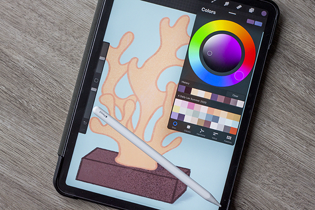
Color is important in art. Different shades convey different feelings and moods. Even the use of only black and white contain intense symbology. The change of the seasons also calls for a change in colors. In summer we turn to brighter and lighter tones to match the warmth and mood of beachy times and late nights. So of course, it was time to create a new color palette for my art. If you recall, I’m doing the Bardot Challenge and use Procreate as my program/medium of choice. I’ve stuck to the same color palette for so long and felt that now would be a good time to update that. Let me show you how I curated my own Procreate color palette for summer.
Decide on your inspiration
I love color so much. I’ve got a dozen folders saved to my computer only filled with color palettes. Design Seeds is where I get most of my color inspiration. I know that I wanted to stay on the lighter side of the spectrum so I browsed around. I found color schemes that spoke to me and saved them. Once I had several of these saved up, I took all these photos into Photoshop for the next step.
Choose your colors
Now comes the hardest part, deciding on what colors to keep and what to toss. Since the Procreate color palette allows only 30 colors per palette, I had a lot of deciding to do. I did this in Photoshop but there are dozens of free to use programs that allow the same techniques. First I created squares and filled them with my desired colors. Then I deleted any colors that were too similar or not as strong when placed next to other colors.
Arrange the swatches
I decided to start with pink first and move down the rainbow with my colors. It’s not perfect but I went with colors that I could use for the next 3 months. I singled out bright and pastel shades that complemented each other. At the very end I added a rust shade for me to sketch with. I use red to sketch and lay down ideas before drawing the final image. But I’ve love rust for so long that I wanted to keep it.

Compare colors
Think about situations you would use these colors for. I noticed that I refer to older Procreate color palettes because the one I was using was missing a color. This time I tried to fill in as many gaps as I could so I wouldn’t switch back and forth between palettes. I think I found a happy medium for what I’ve done and what I hope to do.
Save and download
I saved my finished file as a .jpg and emailed it to myself. Then from there I saved the file to my Ipad and opened it in Procreate. I selected each color and dropped it onto a fresh palette and saved it with the name Summer 2020. Now, just in cause you loved the colors I ended up with, you can download the .jpg here or the .swatches file here. I had a blast creating this and can’t wait until autumn. It’s my favorite season and I’m sure I’ll have too many colors to choose from!
After thoughts
I’ve used this color palette for a week now and I have some thoughts. I wanted to choose colors that I could use all season long and that’s why I have a lot of variation. Sometimes I’ve had to take a starter color from it and either darken it or lighten it to fit what I was doing. I think it’s a great start for my first palette. I’ve learned a lot from doing this and can’t wait to curate the next one!
Please don’t let the message of Black Lives Matter be forgotten. I enjoy drawing while listening to audiobooks. You can see my recommended reading list for more information on the topic in my summer Anti-Racist reading list.


No Comments